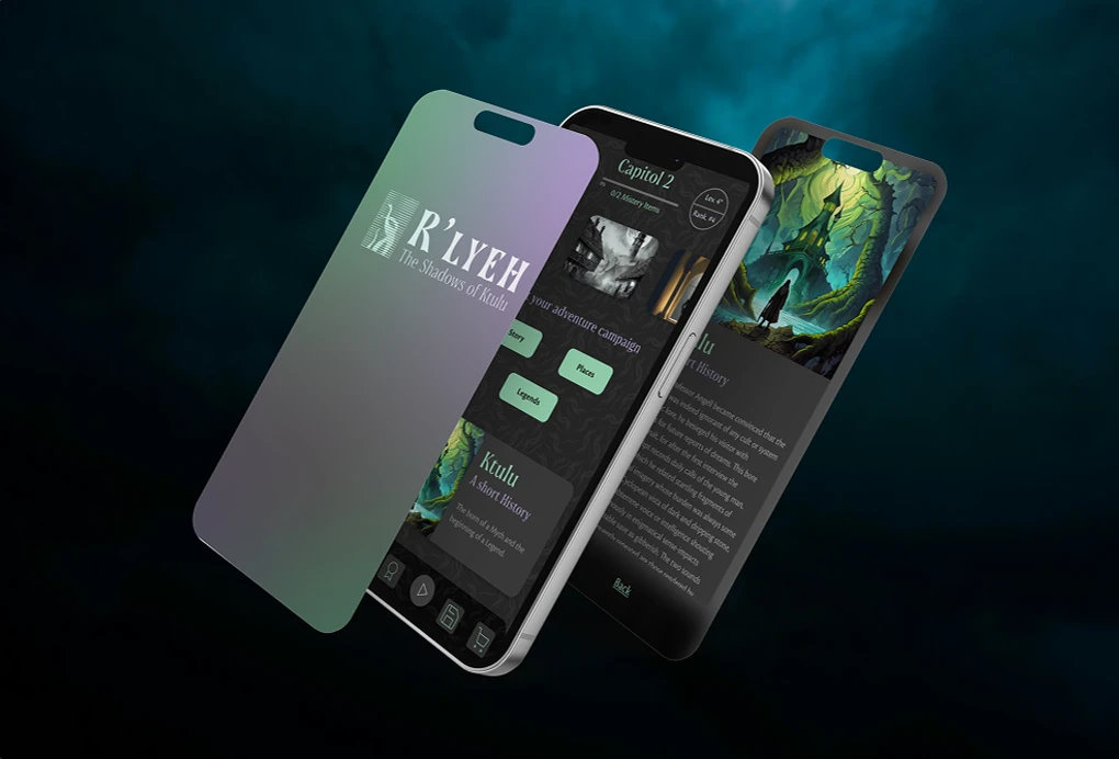
R'lyeh — Into the Darkness
Role
UI/UX Designer
Industry
Gaming
Duration
3 Weeks
Client
Capstone Project
Year
2023
Designing a UI system for a mobile horror game inspired by H. P. Lovecraft requires an approach that goes far beyond conventional app design. For R'lyeh: The Shadows of Cthulhu, the challenge was to develop a visual language that could convey cosmic dread, ancient mystery and psychological tension while remaining functional, intuitive and immersive across all screen states.
Concept & Vision
The central design principle was to treat atmosphere as a function. Every typographic choice, colour decision and spacing rule had to serve two masters simultaneously: the narrative universe of Lovecraft and the practical needs of a mobile game interface. The design system had to appear both ancient and digital — as if the interface itself had been discovered rather than designed.
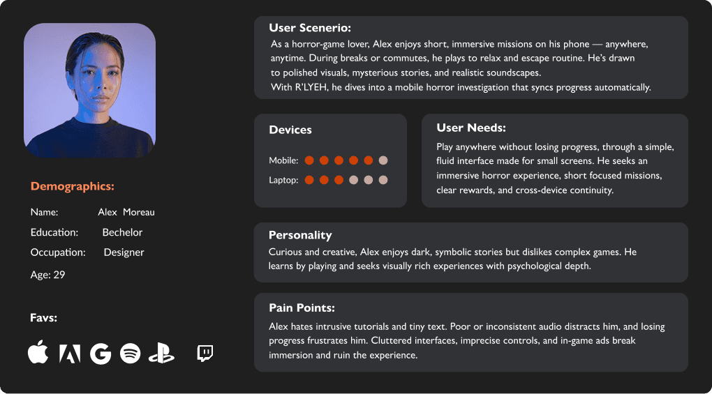
Users
Players who are passionate about horror fiction, mystery and Lovecraftian mythology; people accustomed to high-quality mobile experiences who are looking for intense stories that are accessible anywhere.
Motivations: they want to explore dark worlds, discover secrets and experience strong emotions in a short format that is always available.
Digital habits: they play on mobile devices while travelling, during breaks or in the evening; they are sensitive to well-designed UIs, visual atmosphere and immersive audio.
Design Decisions
Reduced initial information to increase curiosity
Used contrast and scale to guide attention
Introduced progressive disclosure to sustain engagement
Designed visual feedback to reinforce exploration


Experience & Interaction Concept
This project explores how atmosphere, visual tension, and interaction flow can guide user engagement over time.
Rather than focusing only on visual output, the experience is structured as a progressive journey:
Entry → the user is introduced to an ambiguous, low-information environment
Exploration → visual elements and layout encourage curiosity and slow discovery
Tension → contrast, scale, and visual hierarchy create unease and attention focus
Reveal → key elements emerge gradually, rewarding exploration and maintaining engagement
UX Focus
The project investigates how:
visual feedback can guide attention without explicit instructions
interaction pacing can influence user behavior and time spent
uncertainty and discovery can increase engagement and retention
consistent visual language supports immersion and continuity
Relevance to Interactive Design
While conceptual, this approach reflects principles used in interactive and gaming environments, where user engagement depends on:
clear but subtle guidance
feedback loops
progressive information disclosure
emotional and cognitive involvement

Visual Language & Typography
The typographic system combines two carefully selected typefaces. Soprani, a variable serif inspired by a 1920s New Zealand plaque, is used for display and headlines — its dramatically flared serifs and shimmering optical effect evoke the era in which Lovecraft wrote, while remaining unmistakably contemporary. Cronos Pro is used for body text and UI elements, bringing calligraphic warmth and legibility to smaller sizes while maintaining the period atmosphere. Together, they create a voice that whispers rather than shouts.
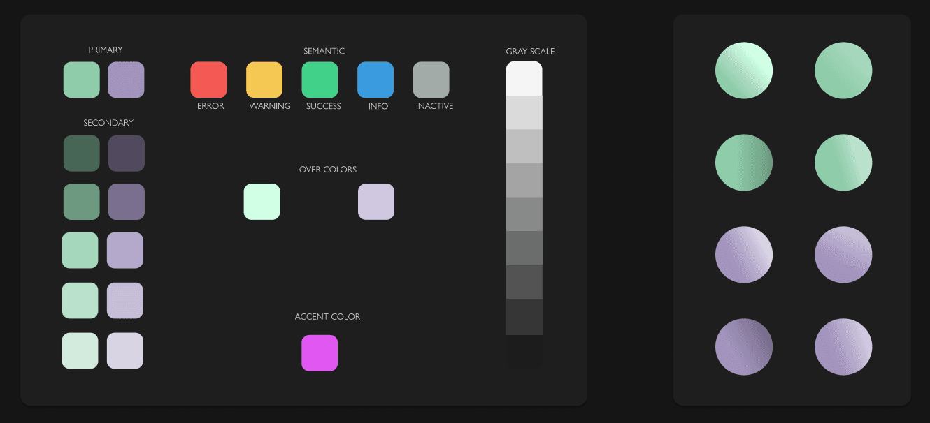
Colours and gradients
The palette is built around two dominant hues, chosen for their symbolic and emotional resonance. The first is an aristocratic purple, which evokes the ancient and elite nature of the cosmic entities that the player encounters. The second is a dangerous and murky green, inspired by the remote and threatening landscapes of Lovecraftian fiction. These primary colours expand into a full gradient system, ranging from deep secondary tones to delicate tints, alongside a complete semantic layer for error, warning, success, information and disabled states. The result is a colour system that is both narratively coherent and technically comprehensive.
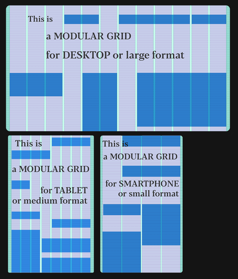
Grid, spacing and components
The layout system is built on three responsive grids — 12 columns for desktop, eight for tablets and four for smartphones — with consistent spacing based on multiples of eight dp. Every component in the system, including buttons, text fields and progress bars, follows this logic to ensure visual harmony across screen sizes and interaction states. The icon set is designed on a 16×16 grid and prioritises simplicity and readability — forms are stripped down to their essential gestures and remain legible even at the smallest touch target.
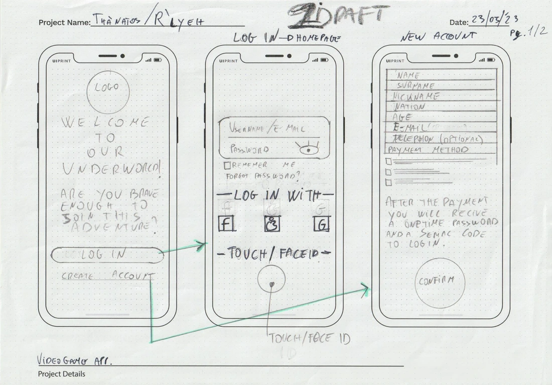
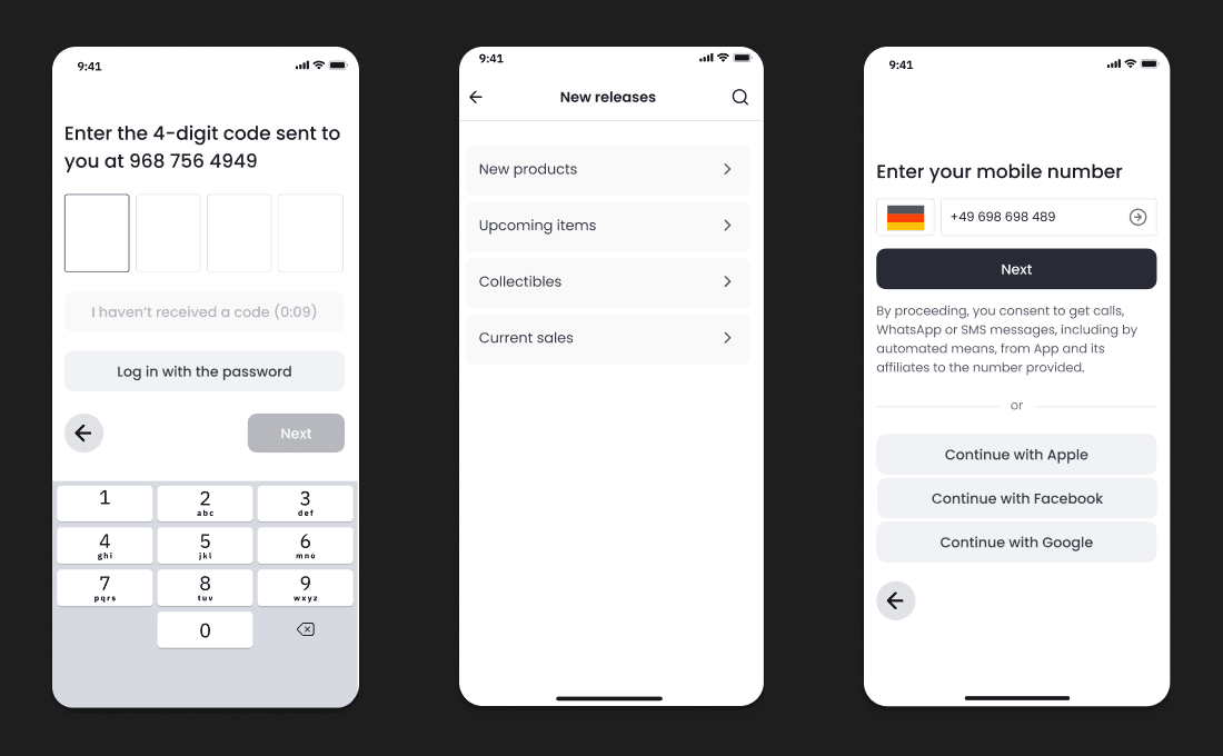
Wireframes and user flow
The interface was developed from hand-sketched wireframes to full digital flows. The onboarding sequence, account creation, campaign selection, tutorial and core gameplay screens were mapped in complete UI wireframes before any visual styling was applied, ensuring the navigation logic was sound before the atmosphere was layered on top. The player moves between two temporal environments — 2024 and the mid-20th century — and the interface subtly changes style between them.


Outcome: The R'lyeh design system is a comprehensive, documented visual framework covering typography, colour, grids, spacing, icons, buttons, selections, cards and wireframes. It is designed to sustain a narrative world throughout the entire mobile experience. It demonstrates that a UI system can be as much an act of world-building as it is an act of design.
This project explores how controlled uncertainty and progressive feedback can increase user engagement and time-on-experience.