Daro

Variable Sans Serif Geometric Typeface

Variable Sans Serif Geometric Typeface

Role

Designer

Duration

6 Month

Year

2023

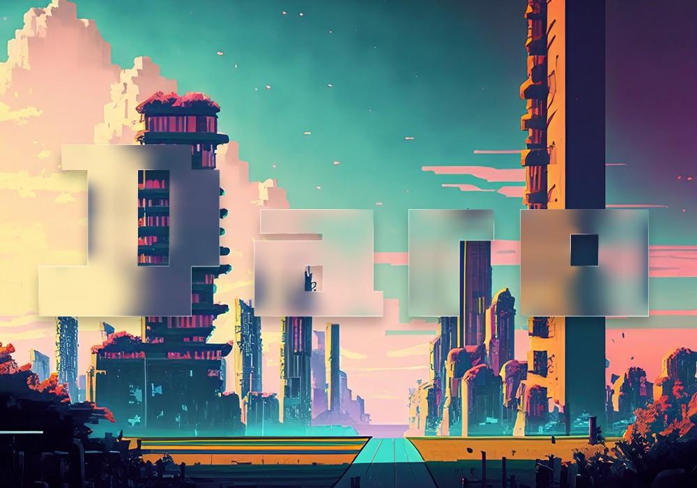
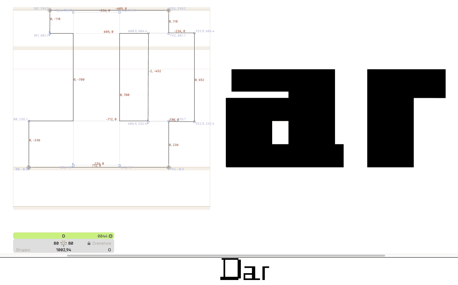
Daro is a sans-serif font. Its name is a combination of two words. "Digital" and "Taro." In Japanese culture, the name "Taro" is given to the eldest son, and it is hoped that, as time goes on, Daro will become the first of many new typographic projects. Daro has been designed to evoke the nostalgia of a bygone digital era and technology, which has resurfaced due to the renewed interest in 8-bit games and the technology of the 1990s. Daro is a striking sans-serif display typeface that embodies the essence of cyberpunk aesthetics, digital technology, and the nostalgic resurgence of 8-bit gaming. Daro is a typeface designed to captivate the viewer with its futuristic yet retro arm. It is a versatile font that seamlessly bridges the gap between the digital age and the neonlit streets of cyberpunk cities, with a unique touch.

  • Languages: IT-DE-FR-EN-ES

  • Weights: 5+Variable

  • Styles: 10

  • File Format: .ttf .woff .woff2

Here free download to test :)


Key Characteristics

Sleek Display Sans Serif Design: DARO features a clean sans-serif design that radiates modernity and simplicity, making it well-suited for both digital applications and print.

Geometric Precision: The typeface embodies geometric precision, characterised by characters formed by a combination of sharp angles and bold, straight lines. This geometry reflects the precision and clarity of the digital realm.

Pixelated Influence: A defining feature of DARO is its subtle pixelated influence. This pays homage to the 8-bit era of video games, with characters containing just enough pixel-like detailing to evoke nostalgia while remaining highly legible.

Variety of Weights: DARO is available in a range of weights, from thin to bold, allowing for versatile typographic expression. This versatility makes it suitable for a wide array of design applications.

Cyberpunk Styling: The typeface incorporates cyberpunk elements, such as sharp corners, jagged edges, and angular terminals, which give it a futuristic, edgy appearance. It's as if the typeface has been plucked from the neon-soaked streets of a dystopian future.

Versatile Ligatures: These ligatures can be used to create unique and visually striking text compositions, adding to its overall versatility.

Digital Aesthetic: DARO embodies the aesthetic of the digital age, making it the perfect choice for projects related to technology, gaming, science fiction, and anything that requires a sleek, modern, and visually captivating typeface.

DARO is a typeface that effortlessly blends the worlds of cyberpunk, digital technology and retro gaming, offering designers a powerful tool with which to create visually compelling and evocative designs. Its clean lines, geometric precision and pixelated nostalgia make it a standout choice for anyone looking to infuse their work with a touch of futuristic, digital magic. Whether you are designing for the future or reminiscing about the past, DARO is the perfect typeface to bring your vision to life.

Thirsty empty tunnel angry alive wait question loudly eye leader true local openly visitor motion. Classroom home popular team clever thirteen clear, case key completely: available surface cook.

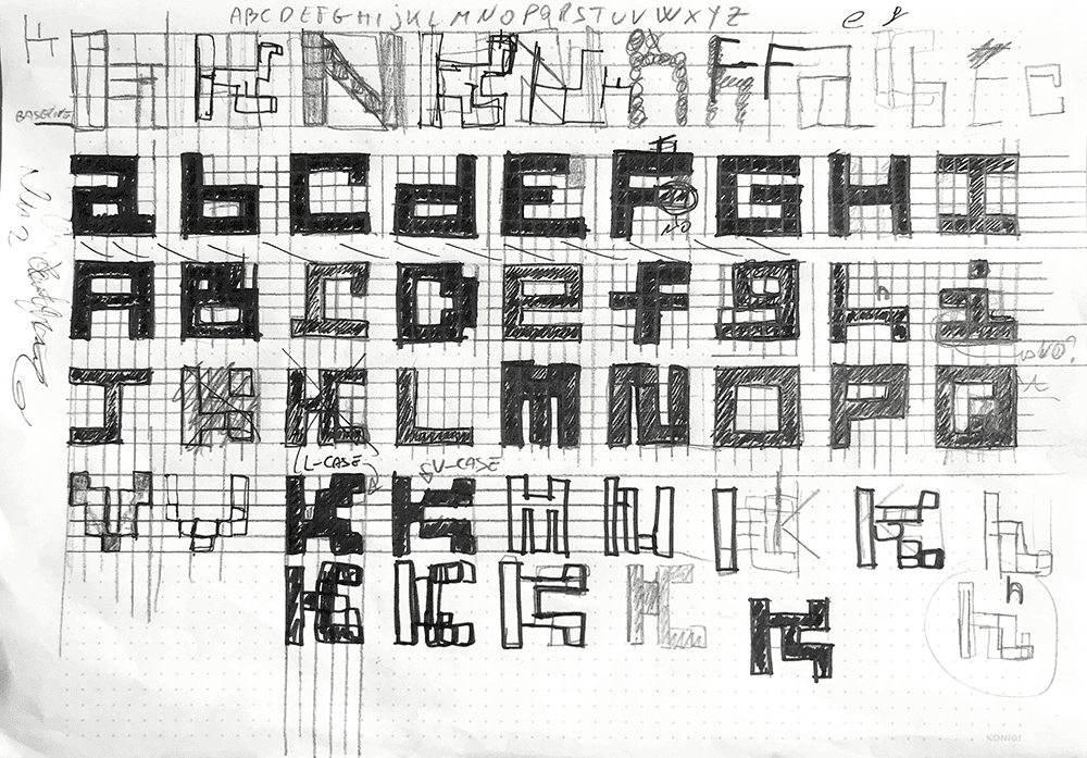
The concept for Daro was inspired by the Epps Evans typeface. This typeface was originally commissioned in 1968 by Christopher Evans, an experimental psychologist whose research explored the potential relationships between computer operations and the processes of the human mind, for Timothy Epps, a graphic design student.

Epps was briefed to develop a typeface that could be recognised by both machines and humans. The design was to be based on a square and a line, eliminating curves and diagonals to make scanning for optical character recognition as easy as possible using the cathode ray tube technology of the time.

The Epps Evans typeface is widely regarded as one of the most minimalist alphabets ever devised. The use of a single case – a combination of capitals and lower-case letters – ensures that most letters and numbers are unambiguous and easy to recognise. This character set is also visually harmonious.

The Epps Evans specimen was never intended for release as a typeface, but was published in 1969 as one of Pieter Brattinga's Kwadraatbladen editions. This was a response to the typeface designed a year earlier by Wim Crouwel for his New Alphabet. As with the New Alphabet, the Epps Evans typeface was not a proposal for practical implementation, but rather an imaginative experiment that speculated on the potential of human/machine interfaces and computational communications. Its reduced forms are reminiscent of the dignity of square Kufic glyphs from the Arabic calligraphy tradition, while subtly foreshadowing the bitmap type of the 1980s digital era.

Quote from The Visual History of Type by Paul McNeil


Interested in connecting?

Let’s talk projects, collaborations, or anything design!

Interested in connecting?

Let’s talk projects, collaborations, or anything design!

Create a free website with Framer, the website builder loved by startups, designers and agencies.